Banquet Royalty

 This layout was created for the Royal Blue Challenge at DigitalScrapbook.com—such a fun excuse to dive into one of my favorite bold colors! I pulled together bits and pieces from several different kits on the site to build this page, mixing florals, glitter, and patterned papers to complement the deep royal blue theme. The photos are from Jessica’s senior banquet at Freeman Academy, where she wore the most stunning sequin-covered gown. I loved how the rich blues in the layout brought out the elegance and sparkle of her dress, making the whole page feel just as special as the night itself.


Layout Template #477 by Marisa Lerin


This page practically sparkles on its own—just like Jessica did that night. Between the sequins, the bold royal blue, and all those layered details, I couldn’t have asked for a more eye-catching combo. Mixing pieces from different kits gave me the freedom to go full glam, and honestly? This layout wears glitter better than most red carpets.

Until next time, scrap your story, share your heart, and always be kind.

Cutest Cupid in Town


For this digitalscrapbook.com challenge, another scrapper chose the bundle—and I think they picked a winner! I had so much fun creating my page with the bold and bright “Vanessa” kit by Rachel Martin. The playful mix of hot pink, teal, lime green, and all those fun arrows and butterflies were just right for my Valentine-themed layout. It brought out the cute in my photos and made the whole page pop with personality!
Cutest Cupid in Town

The Vanessa kit is full of spunky charm with its eye-catching color combo and playful mix of patterns. From stitched hearts and bold arrows to layered flowers and pops of glitter, it’s bursting with creative possibilities. Whether you're scrapping sweet moments or just adding a splash of fun, this kit brings the bold energy.


Ya'll know I love to start with an awesome template this one came from Marisa Lerin 87a

On my page, I added some extra sparkle by layering hot pink glitter paper right onto the arrows, giving them a bold, fun pop that really stands out. I also applied a style to the silver hexagons, turning them into shiny gold to better match the little gold gem details I wanted to include. These small changes helped everything feel more coordinated and gave the layout a playful, glitzy vibe that fits perfectly with the bright colors of the kit. It’s always fun to add those personal touches!

Bright colors, fun details, and just the right amount of sparkle! 

Until next time, scrap your story, share your heart, and always be kind.

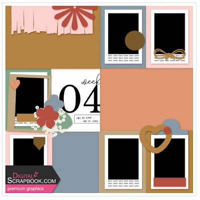
Welcome to Week 23!


 This week’s pocket page is bursting with bright colors, sweet moments, and a little chaos—the good kind! From outdoor playtime and cupcake-covered faces to cozy naps on teddy bears and a bit of beauty practice (hello, eyeliner wings!), it’s all here. We didn’t have our usual Sunday Supper, but the kids still made time to swing by with cupcakes, which made my heart just as full. Life’s all about these little snapshots—and I love capturing them one week at a time. 


I used the Collected Curiosities #17 bundle by Billie Irene for this layout, and it was a perfect match! The bright, playful colors—bold blues, cheerful pinks, rich greens, and a rainbow of accents—really brought out the fun and energy in my photos this week. I love how this kit mixes whimsy with a vintage touch, and the layered textures, florals, and charming little elements added just the right amount of flair to tie everything together. It made documenting this colorful, cupcake-filled week extra fun!

That wraps up Week 23—a colorful collection of sweet faces, silly moments, and simple joys. I had so much fun putting this page together using the Collected Curiosities #17 bundle by Billie Irene. The bright, happy colors were just what I needed to complement the playful chaos of the week—from messy cupcakes to teddy bear naps and everything in between. This kit brought the whole story to life with its fun mix of florals, textures, and charming little bits. Can’t wait to see what next week brings!

Until next time, scrap your story, share your heart, and always be kind.

Our Good Life


One of my favorite techniques in digital scrapbooking is using a photo mask—it’s such a simple way to create a big visual impact! A photo mask helps blend your photo into the background or shape it in a creative way, drawing the eye right to the heart of your page. Whether you're going for soft edges, a bold silhouette, or an artsy paint-stroke effect, masks make your photo the star of the layout. I love how they add depth and interest without overwhelming the rest of the design. For this page, the photo mask really brought the focus to the moment I wanted to highlight most!  I thought I came up with a pretty creative way to use it along with a pocket scrapbooking page.

This page just makes me smile! I used the super fun and colorful Fieldnotes #17 bundle—it’s full of bright papers, flowers, and playful little extras that I just love using. I pulled together a mix of family photos, including some silly ones of Jessica and a few special moments like her Make-A-Wish trip to Tokyo in 2018. I really wanted to capture the fun, happy energy of our time together. Jessica has always had a knack for snapping photos when no one’s looking (and usually when we’re making weird faces!). I added a few clusters, some rainbow word art, and lots of pops of bright beautiful color to match our goofy, sweet, and joy-filled life.


The Fieldnotes #17 Digital Scrapbook Bundle by Marisa Lerin is exactly the kind of kit I delight in—bright, bold, and bursting with happy energy! It’s packed with playful elements like hand-drawn flowers, colorful butterflies, fun tags, and cheerful word art that instantly make a page come to life. The rainbow-striped papers, messy paint textures, and vibrant patterns are perfect for adding that joyful pop I’m always drawn to. Whether I'm scrapping sweet everyday moments or just playing with color, this bundle makes it easy (and fun!) to let my creativity shine. If you love bright kits like I do, this one’s a total treat!


I just enjoy how the photo mask added that extra pop to my layout—bringing attention right where I wanted it while still blending beautifully with the fun, colorful vibe of the page. Paired with the bright papers and happy little pocket-style elements, everything came together just right. This page makes me smile every time I see it, and that’s exactly what scrapbooking is all about—preserving memories in a way that brings joy all over again!

Until next time, scrap your story, share your heart, and always be kind.

Joy of Books

Color Palette Challenge from Digitalscrapbook.com

"A unique aspect about Digital Scrapbook are all those individual graphics that the upload Teams and designers take extra efforts in getting uploaded to the site. This accomplishes two things. First, it allows everyone who has a free account to download 5 graphics a day for free. Secondly, it allows you the flexibility to download just what you want, when you want it. 

Let's show some individual graphic love and use these to create a page as opposed to using a full kit. I chose some summery colors for you this time! 

Use only items from any or all of these color search links: "Teal" | Turquoise | "Ivory" | "Mustard Yellow" "Red""
This layout was created for the Color Palette Challenge over at DigitalScrapbook.com, and I had such an enjoyable time working with this vibrant mix of mustard yellow and teal. The cheerful palette brought just the right energy to these sweet photos of Jessica enjoying one of our favorite pastimes—bookstore visits! I loved using these bold colors to highlight the playful, story-filled theme, and the rich floral accents and paint splatters helped tie it all together. The pops of word art like smilestory time, and books added a fun storytelling touch to match the memory.

Found in Digitalscrapbook.com Commons
The layout I picked for this Color Palette Challenge features a fun and modern diagonal design with strong visual movement from corner to corner. It includes two photo spots—one near the top right and one toward the bottom left—each accented by layered floral clusters and playful swirls. The diagonal stripes in the background help guide your eye across the page, while still keeping the focus on the photos. I loved how this template gave me a great balance of structure and creativity, with space to showcase both pictures and embellishments beautifully.

This Color Palette Challenge was such a joy to create for—between the vibrant colors, the playful template, and the sweet memory captured, it all came together perfectly. I love how the layout highlights our special story time moments and our shared love for books. Thanks for stopping by to take a peek at my page—hope it inspires you to document a favorite memory of your own!

Until next time, scrap your story, share your heart, and always be kind.

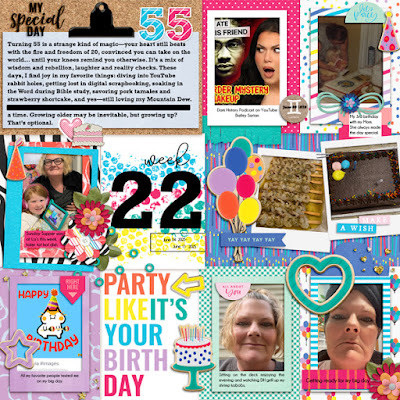
Hello 55!


This week's pocket-style page is extra special—it celebrates not only a new challenge day but also my 55th birthday! I had fun diving into this bright, bold, and joy-filled layout that captures the fun, the feelings, and even a few silly selfies from my special day. Turning 55 feels like a mix of magic and mischief—equal parts wisdom and wonder. I wanted my page to reflect that blend of celebration and reflection, with pops of color, heartfelt journaling, and playful touches like cake, balloons, and birthday sparkle.

Some of my favorite highlights: a sweet Sunday supper with family, a giant chocolate cake, and a moment to just sit outside and soak it all in. I included snapshots from the day, along with bits of what’s bringing me joy lately—like YouTube deep dives and strawberry shortcake! I love how digital scrapbooking lets me hold onto all those pieces and moments in one place. Cheers to 55 and this beautiful, crazy life!


The "Make a Wish" Collab Bundle from DigitalScrapbook.com is a total celebration in digital form! I absolutely loved working with this bundle—it's bursting with bright, happy colors that instantly bring the party vibes. From confetti and cupcakes to balloons, candles, and birthday flair, every element is designed to make your pages feel joyful and festive.

There’s a great mix of bold patterns, fun word art, playful tags, and dimensional embellishments that layer beautifully. Whether you’re scrapping a birthday, a milestone, or just a week filled with happiness, this bundle makes it easy to tell your story in a colorful, uplifting way. It was the perfect choice for documenting my 55th birthday celebration!


This layout was such a joy to put together—a celebration of turning 55, embracing the little things, and using bright, beautiful supplies like the Make a Wish bundle to tell the story. It’s pages like this that remind me how special everyday moments can be when we take the time to capture them. Whether it’s cake, laughter, or just sitting outside with a smile, I’m grateful for it all. Here's to more scrapping, more color, and more reasons to celebrate!

Until next time, scrap your story, share your heart, and always be kind.

My Happy Place


One of the more challenging types of prompts for me at DigitalScrapbook.com is the Scraplift Challenge. The idea is to choose an inspiring layout from a curated list and use it as a blueprint—keeping the overall design or feel similar, but putting your own creative spin on it. It’s not always easy! Sometimes I catch myself making my page look too much like the original. When that happens, I have to remind myself that this isn’t a CASE challenge (Copy And Study Everything), it’s a scraplift—meant to spark inspiration, not imitation.

For this round, I picked a bright and beautiful layout full of sunflower tones that immediately spoke to me. I kept the vertical structure and that cheerful yellow vibe, but gave it my own twist with a summer vacation theme. I swapped the original’s coffee shop charm for a breezy, outdoor feeling. Instead of two angled photos, I used one centered snapshot, added a bold wooden frame, some florals, a sunshine element, and a ribbon bow to bring in warmth and movement. The scalloped edge detail felt like the perfect touch of playful fun. With word art like “happy summer” and “my happy place,” this layout became a joyful little celebration of sunshine and memory-making.

While the original layout feels like a cozy pause over a cup of coffee, mine captures that carefree feeling of being in your favorite place with your favorite people on a sunny day.

This time, I was drawn to a layout that practically glowed with sunshine. That bold stripe of yellow with sunflower accents just popped off the screen and I knew instantly: this was the one! 

To create my scraplifted page, I used the vibrant Tinsley Bundle by Rachel Martin. This kit is bursting with warm summer colors—yellows, peaches, corals, and soft browns—that were perfect for capturing that sunshiney feeling. I pulled a mix of patterned papers for the background and especially loved using the scallop border piece to echo the playful edges from the original layout. I layered in floral clusters, cheerful word art, and that stitched sun element to tie it all together. This bundle made it so easy to create something bright, happy, and totally “me!”


Scraplifting is such a fun reminder that inspiration is everywhere—and it’s even better when you get to put your own heart into it. I loved working with the cozy yellows and bright flower vibes on this one. It was a joy to take a beautiful layout and give it my personal twist.

If you’ve never tried a scraplift challenge before, I highly recommend it. It’s a great way to spark ideas and stretch your style in a whole new direction.  Here is a link for you to the Layout Challenge thread at digitalscrapbook.com

Until next time, scrap your story, share your heart, and always be kind.

Throw Your Cap in the Air

This month over at DigitalScrapbook.com, we're throwing our caps in the air with a fun challenge all about celebrating the graduates!  For my take, I chose to highlight J-one year post–high school graduation and already making waves! She's working at Vanderbilt as a phlebotomist (her dream employer!) and will be starting nursing school this fall. I just had to document this proud mama moment with a layout that captures her success, growth, and the bright future ahead. 

I started with this adorable graduation-themed quick page from digitalscrapbook.com, which already had so much charm with its vintage damask-style background, dotted center panel, and classic grad elements like the cap, diploma scroll, and that fun "The tassel is worth the hassle!" word art. To make it my own, I added a bold navy frame around the photo spot to help my image pop, swapped in a different arrow for a bit more dimension, sprinkled in some glittery navy stars for a celebratory feel, and included extra word art to tell a bit more of the story.  Just a few little tweaks brought it from quick page to personal keepsake!

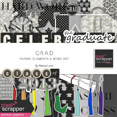
If you’d like to recreate a similar look or just add to your stash, I’ve linked a couple of the main kits I used below. They were perfect for adding that polished, personalized feel to this keepsake layout. I’m also including a few extra graduation-themed kits that are totally worth checking out—great for celebrating every cap toss, diploma, and proud moment! 


It’s always so rewarding to take a ready-made quick page and give it a personal twist. With just a few extra elements and meaningful touches, this layout became a treasured snapshot of a huge milestone. Whether you're celebrating a recent grad or reflecting on the journey, I hope this inspires you to dive into your own stash, explore a few new kits, and create something special. Don’t forget—every tassel tells a story! 

Until next time, scrap your story, share your heart, and always be kind.

Roaring Good Time


I had so much fun playing along with the Discover Digital Scrapbooking challenge over at DigitalScrapbook.com—and what better way to show off a day full of prehistoric fun than with this dino-mite layout?! This page features a visit to Dinosaur Park in Rapid City, SD, where the kids climbed, posed, and roared their way through a sunny afternoon of adventure. 

The bright yellows, cheerful stripes, and cute little dino element made this page just as fun to create as the outing itself. It’s the perfect mix of silly and sweet—and exactly the kind of layout that reminds me why I love scrapbooking these everyday moments.


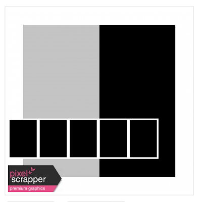
The challenge template features a clean, balanced design with a large vertical photo block on the right and a bold title or journaling space on the left. Along the bottom, five smaller photo spots create a fun filmstrip effect—perfect for showing off a series of moments or expressions. It’s simple, versatile, and super fun to personalize!

Layout Template 46 

You can find Marisa's tutorial HERE


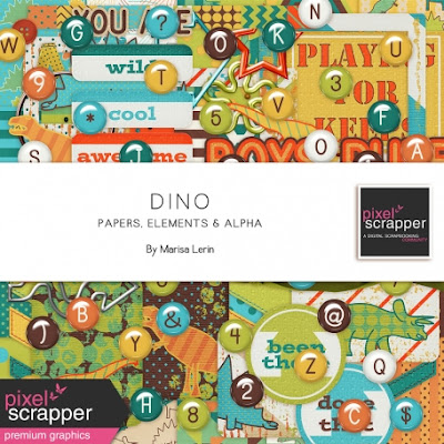
This playful Dino bundle by Marisa Lerin is bursting with bold colors, funky alphas, and dino-sized fun!  I used the striped background paper, dot paper & that adorable little dinosaur element to bring my layout to life. The kit’s retro vibes and colorful mix made it the perfect match for our prehistoric park adventure. 
Totally rawr-some!

Here are links to the fonts used:

Sometimes the best inspiration comes from a little trip to the archives! Whether it’s revisiting an old tutorial or rediscovering a forgotten technique, digging into past resources can spark fresh ideas and remind you of tools you haven’t used in a while. I love how one small prompt or layout can lead to new insights—or just bring back the joy of creating for the fun of it. Don’t be afraid to scroll back and explore—you never know what treasures you’ll uncover!

Until next time, scrap your story, share your heart, and always be kind.

Sassy Swimmer??


This layout captures one of my favorite memories from our trip—my sassy little Marissa, age 3, striking a pose in her signature style! She wasn’t a fan of the water, but she was all about riding in the golf cart with Grandma. We did laps for two whole hours while the rest of the family swam. At the end, as I started to get off, she simply said, “Goodbye, Grandma”—ready to keep going without me! This photo says it all: bold, adorable, and full of personality. The layout’s playful pinks and cheerful patterns match her spirit perfectly.

What a fun deep dive into the archives! This layout template by Marisa Lerin 23168—dating back 12 years—is a perfect example of her playful, clean, and creative design style. With its vertical flow, whimsical swirls, and thoughtful space for both journaling and a central photo, it draws the eye right down the page. The bold elements add a graphic punch.  It’s simple yet full of movement—ideal for spotlighting a single memory with lots of personality. 

A timeless design that still shines today!


This challenge was all about diving into a Good Life bundle from June—and I knew exactly which one to grab! I chose the June 2018 edition, full of playful pinks, cheerful teals, and pops of citrusy color that matched my photo perfectly. This bundle just screams summer fun, and the vibrant elements brought my layout to life. I love when a kit feels like it was made just for your memory—this one did not disappoint!

There is a new Fieldnotes #18 available as well.  I took the palm tree charm from this kit.


String Styles by Sheila Reid

Beach Type is the font used and it comes from Dafont.com

Wrapping up this sweet memory, I’m so glad I chose the June 2018 Good Life bundle—it had just the right vibe to capture the fun, color, and personality of the moment.  That’s what I love most about scrapbooking: the joy of pairing the perfect kit with a cherished memory.  Bright colors, big smiles, and little stories all stitched together.  
Here’s to more moments that make us pause, smile, and say, “This is the good life.”

Until next time, scrap your story, share your heart, and always be kind.

When the Pieces Fall into Place


“But we ought always to thank God for you, brothers and sisters loved by the Lord, because God chose you as firstfruits to be saved through the sanctifying work of the Spirit and through belief in the truth.” 

2 Thessalonians 2:13 (NIV)

Some days, everything just clicks—and today was one of those days.

I sat down to work on a layout with no clear plan except the photo I wanted to highlight. Then I opened this bundle... Mwah! It was love at first sight! The premade cluster instantly became my focal point, and those floral and plaid background papers? Perfection. Just the right blend of soft and cheerful to frame my photo and bring the whole story to life.

I can’t help but smile when things come together so seamlessly. It reminds me of how God, in His perfect wisdom, pieces our lives together too.  Just like the verse says, we are chosen and loved—called by name and sanctified through the Spirit. Every detail of our lives is held in His hands, even our little creative moments like this.

So today, I'm thanking God—not just for pretty papers and perfect clusters, but for His constant love and His divine design in all things. 

This vibrant scrapbook page is a beautiful expression of faith, love, and the joy of a sunny day. The layout features a warm photograph, perfectly framed with cheerful florals and layered papers that reflect the uplifting tone of the verse. The digital elements used in this layout are from “The Good Life: July 2019 Bundle” available at digitalscrapbook.com. This bundle is filled with rich summer hues—teals, purples, corals—and charming embellishments like layered flowers, hearts, and textured word art that add depth and personality. The mix of plaids, florals, and playful tags help create a dynamic, faith-filled design that radiates warmth and gratitude. It's a wonderful tribute to both a cherished memory and a timeless truth.


We are deeply loved and purposely chosen, and sometimes the best way to remember that is to step outside, breathe in the beauty of His creation, and simply be still in His presence. Let His love settle over you like sunlight through the trees.

Until next time, scrap your story, share your heart, and always be kind.

Hello June!


Can you believe it's already June? A brand new month means fresh inspiration, new memories to document, and of course—new layout challenges over in the forums at DigitalScrapbook.com!

Whether you're catching up on past projects or ready to dive into something new, the challenges are a great way to spark creativity and connect with other scrappers. There’s something for everyone—so grab your favorite kit, open up your program of choice, and let’s get scrapping!

This layout is my reflection on a difficult chapter in my life—having my knee rebuilt at 41 and learning to trust God through the pain and healing. I used James 1:2–4 to remind myself (and others) that trials produce steadfastness, and through them, we are made stronger. This month’s layout theme of Personal Growth and Reflection really spoke to me, and I wanted to share how even in brokenness, we are never truly broken. 


For this layout, I started with a template—one of my favorite ways to begin. I love how a good template gives me a foundation to build on while letting the story and emotion take shape as I add my own touches.

This alpha from the Baking Days collection was the perfect choice for my layout. The playful yet bold style brought a sense of joy and strength—which mirrors the emotional tone of my story: facing a hard trial but holding onto faith.

I used the teal alpha to highlight key words like “Joy” and “Perfect”, pulling those directly from both the scripture and my reflection. The teal tone not only coordinates with the rest of my page, but also visually reinforce the message of hope, renewal, and personal growth.

The mix of uppercase and lowercase letters gives it a slightly whimsical, human feel—which felt just right for a page that’s both honest and hopeful.


 How the Kit Enhances My Theme

 Deep Emotional Tone:

The kit’s name—Reflections—says it all.  My layout is a heartfelt reflection on a time of pain, perseverance, and spiritual growth. This kit’s soft, soulful imagery (like the pensive illustrated woman and vintage elements) mirrors that introspective tone and brings a tender emotional depth to the page.

 Visual Harmony:
The teals, corals, and soft neutrals in the kit complement my photos and tie in beautifully with the Baking Days alpha and other page elements. The flowers and butterfly I used add softness, transformation and hope, symbolizing renewal—while the gears represent strength and resilience.

Reflections from Cindy Ritter over on Gingerscraps


I can't wait to see what you create. 
Happy June friends!

Until next time, scrap your story, share your heart, and always be kind.

Banquet Royalty

 This layout was created for the Royal Blue Challenge at DigitalScrapbook.com —such a fun excuse to dive into one of my favorite bold colors...